279
By: Bernardus Ari Kuncoro
A waterfall chart can show you how positive or negative values in a data series contribute to the sum of the numbers. Such as the income and spending result in a net balance in your money or bank account.
To illustrate this chart, Excel can help you with these four simple steps.
Here you go.
1. Prepare and select the dataset
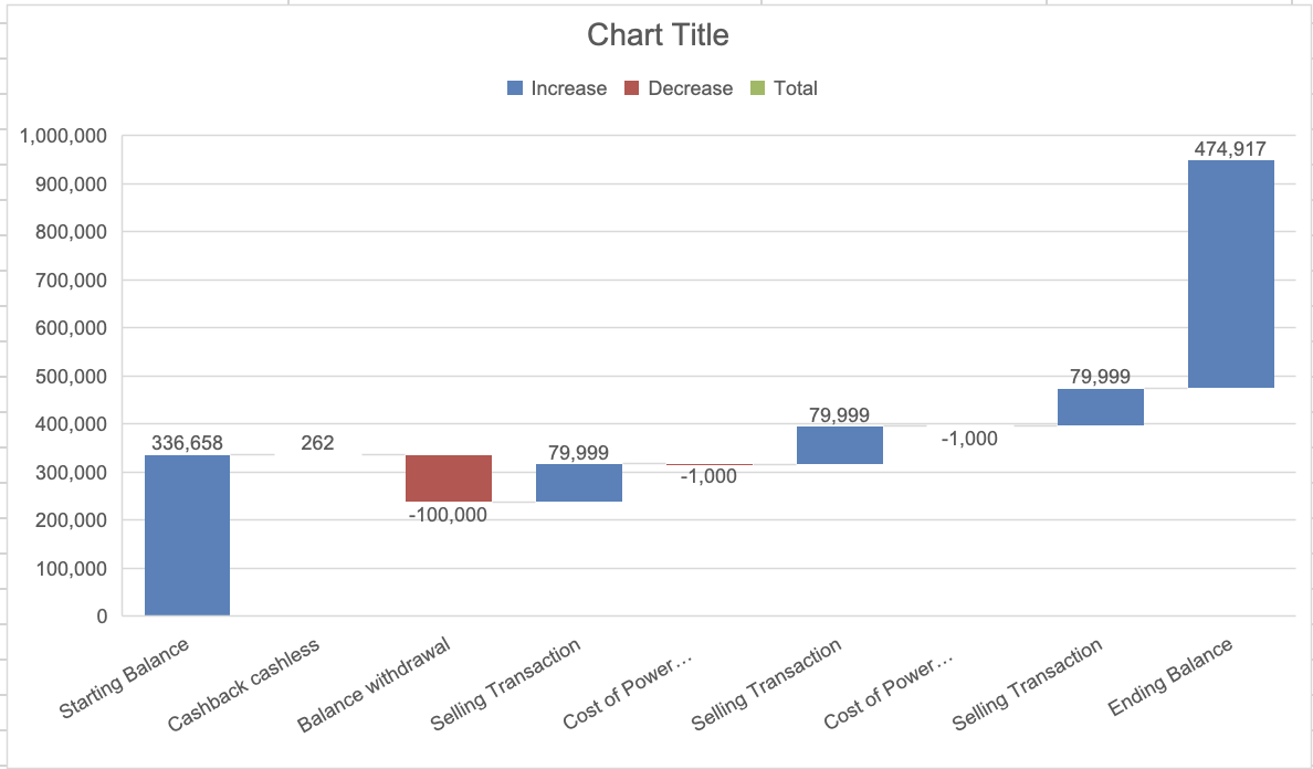
In this example, we’re utilizing a simple historical transaction from my online marketplace book sale transactions. I manipulated columns C and D, hence the starting and ending balance were shown. Select the data columns C and D.

2. Insert Waterfall Chart button
From the tab, on top of the left, click Insert, then select the Waterfall chart button.
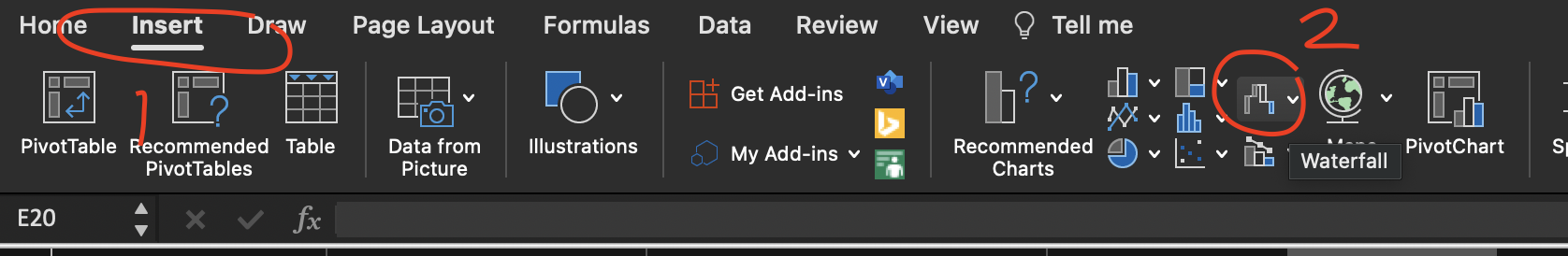
Excel will create the chart based on selected data. Column C (Category) will be the x-axis. While Column D (Nominal Rp.) will be the y-axis.
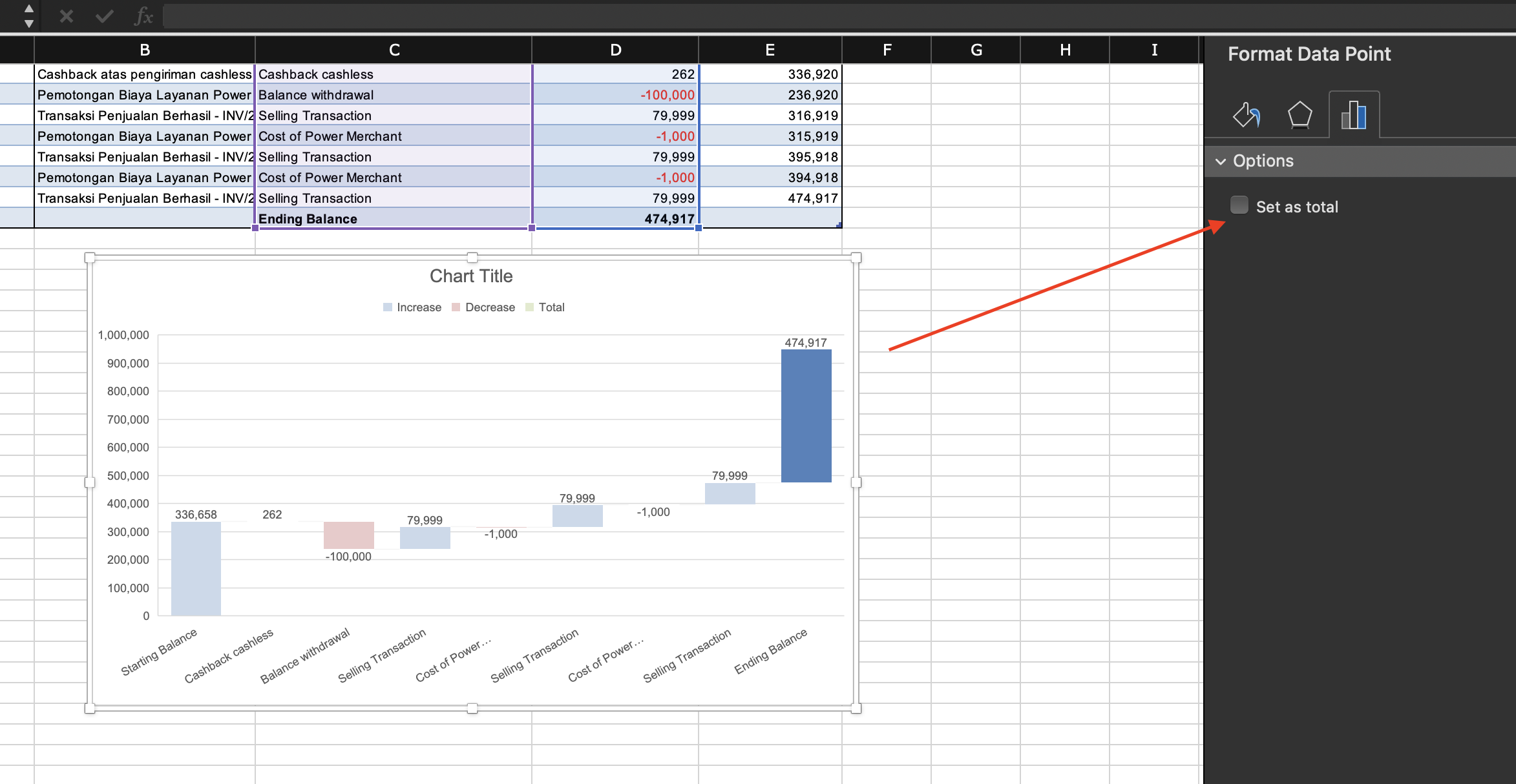
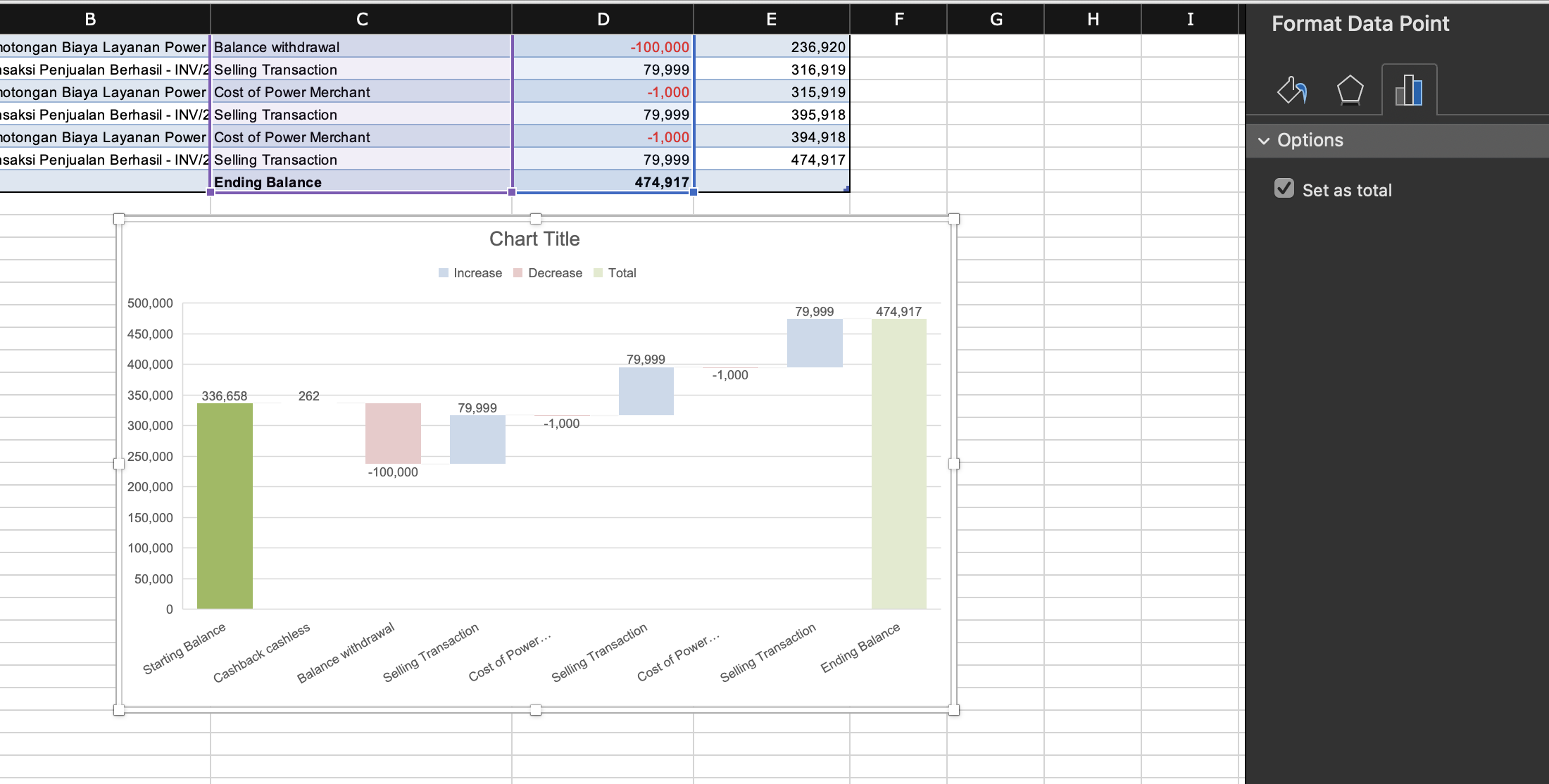
3. Identify the total or subtotal from the other values
You should set starting and ending balance as totals by double-clicking the data points. First, do it for ending balance.
Second, do it for starting balance.
4. Put the details in the chart
You can format the chart by editing the cart title, choosing different fonts, and formating the gridlines. You may use the Design tab if you want to make it faster.
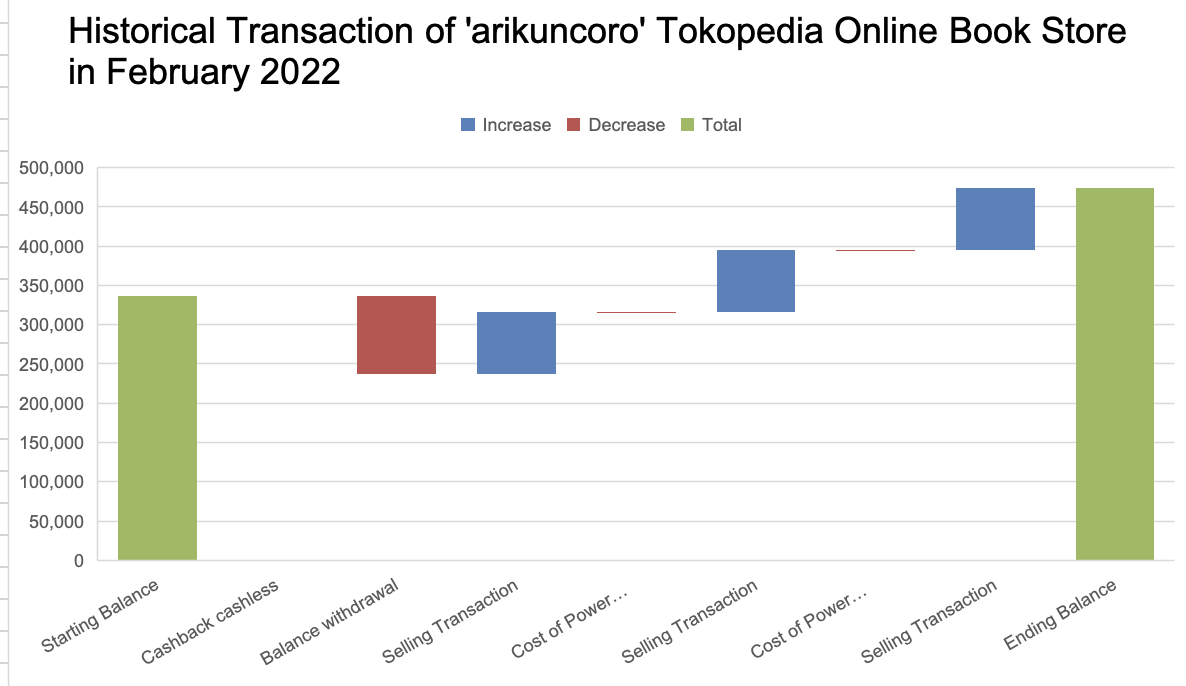
A waterfall chart is a good way to see the individual observation or category contributes to the whole. To use this Waterfall Chart automatic feature creation you should at least install Excel 2016. Previously you have to make this chart manually.
Kalideres, 18 January 2022