
280
By: Bernardus Ari Kuncoro
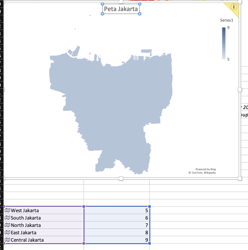
A few months ago I have tried to make a map graph with Excel. It will show you a graph that shows a map, in which the different colors represent the numbers or measurements.
Preparation
What do you need?
- Microsoft Excel (version 365 or 2016 and up)
- BPS Dataset
Instructions
- Download BPS Data. The link is on preparation.
- Open a new file with Microsoft Excel
- Clean the dataset
- Find and replace a space with empty characters
- Find and replace comma with dot (make sure the decimals convention is using dot, instead of comma).
- Remove the x character in one of the cell
- Insert > Table (make sure that you have a header in our table).
- Format the location column (in this case is provice) by selecting Province, Data, and Geography
- Select provinsi column, in this case the population density. Then Insert ? Maps.
- Give some details in the graphic for setting the density colors. In this case, you can use right click on the map, format data series and change gradient style with diverging. Green (50). Yellow (100). And, red (100).
To be clear, you can watch the video below. I have edited the video speed, so it will be packed with IG Reels (30 seconds). Enjoy!