Yesterday I continued a Datacamp online course named Introduction to Machine Learning. Frankly, this course is very useful to strengthen my understanding in machine learning! Plus, I am a big fan of R! The more you repeat the course, the more you understand the meaning of it. Well, the topic was about “comparing the methods”. It is part of chapter 3 – Classification topic, precisely at the end of the chapter. It says that the powerful tool to compare the machine learning methods, especially classification, is ROC Curve. FYI, out of the record, this ROC curve analysis was also requested by the one of the client. 😉
What is ROC?
ROC stands for Receiver Operating Characteristic. In statistics, it is a graphical plot that illustrates the performance of a binary classifier system as its discrimination threshold is varied. Electrical engineers and radar engineers during World War II firstly developed the ROC curve for detecting objects of enemy, then soon used by psychologist to account for perceptual detection of stimuli. At this point, ROC analysis has been used in medicine, radiology, biometrics, machine learning, and data mining research. (Source: here).
The sample of ROC curve is illustrated in the Figure 1. The horizontal axis represents the false-positive rate (FPR), while vertical axis represents the true-positive rate (TPR). The true-positive rate is also known as sensitivity, recall or probability of detection in machine learning. The false-positive rate is also known as the fall-out or probability of false alarm and can be calculated as (1 −specificity).

Figure 1. ROC Curve – Source: Wikipedia.
How to create this curve in R?
You need:
- Classifier that outputs probabilities
- ROCR Package installed
Suppose that you have a data set called adult that can be downloaded here from UCIMLR. It is a medium sized dataset about the income of people given a set of features like education, race, sex, and so on. Each observation is labeled with 1 or 0: 1 means the observation has annual income equal or above $50,000, 0 means the observation has an annual income lower than $50,000. This label information is stored in the income variable. Then data split into train and test. Upon splitting, you can train the data using a method e.g. decision tree (rpart), predict the test data with “predict” function and argument type=”prob”, and aha… see the complete R code below.
set.seed(1)

# Build a model using decision tree: tree
tree <- rpart(income ~ ., train, method = "class")

# Predict probability values using the model: all_probs
all_probs <- predict(tree,test,type="prob")

# Print out all_probs
all_probs

# Select second column of all_probs: probs
probs <- all_probs[,2]

# Load the ROCR library
library(ROCR)

# Make a prediction object: pred
pred <- prediction(probs,test$income)

# Make a performance object: perf
perf <- performance(pred,"tpr","fpr")

# Plot this curve
plot(perf)
The plot result is as follow:

How to interpret the result of ROC?
Basically, the closer the curve to the upper left corner, the better the classifier. In other words, the “area under curve” should be closed to maximum value, which is 1. We can do comparison of performance based on ROC curve of two methods which are Decision Tree (DT) and K-Nearest Neighbor K-NN as seen in Figure 3. It shows that the DT method that represented by red line outperforms K-NN that represented by green line.
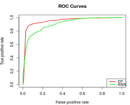
The R Code to draw Figure 3 is represented by the following code:
# Load the ROCR library
library(ROCR)

# Make the prediction objects for both models: pred_t, pred_k
# probs_t is the result of positive prediction of Decision Tree Model
# probs_k is the result of positive prediction of K-Nearest Neighbor
pred_t <- prediction(probs_t, test$spam)
pred_k <- prediction(probs_k, test$spam)

# Make the performance objects for both models: perf_t, perf_k
perf_t <- performance(pred_t,"tpr","fpr")
perf_k <- performance(pred_k,"tpr","fpr")

# Draw the ROC lines using draw_roc_lines()
draw_roc_lines(perf_t,perf_k)
Area under curve (AUC) parameter can also be calculated by running this command below. It shows that the AUC of DT is 5% greater than K-NN.
# Make the performance object of pred_t and pred_k: auc_t and auc_k
auc_t <- performance(pred_t,"auc")
auc_k <- performance(pred_k,"auc")

# Print the AUC value
auc_t@y.values[[1]] # AUC result is 0.9504336
auc_k@y.values[[1]] # AUC result is 0.9076067
Summary
- ROC (Receiver Operator Characteristic) Curve is a very powerful performance measure.
- It is used for binomial classification.
- ROCR is a great package to be used in R for drawing ROC curve
- The closer the curve to the upper left of area, the better the classifier.
- The good classifier has big area under curve.